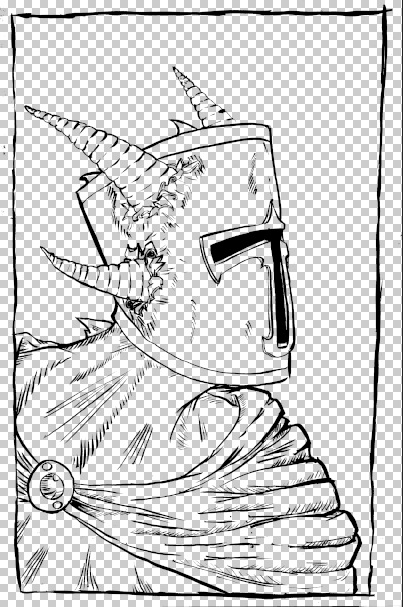
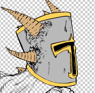
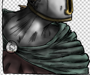
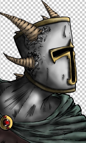
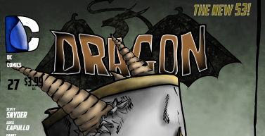
I decided that the best way for me to draw this cover would be to do it all digitally. I used the drawing software Paint Tool Sai and my graphics tablet in order to draw a thick to thin scratchy outline that resembled fur. This made the whole drawing and colouring process quicker rather than have to draw the whole thing out on paper and then again in ink.
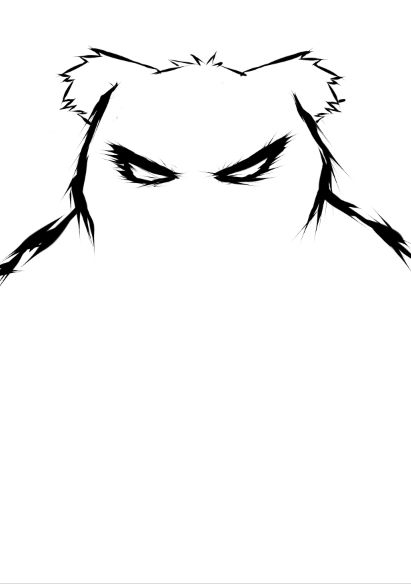
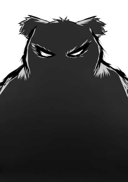
What I wanted next was for the eyes to pop out from the image, which meant I needed a bright colour that would cut through the image and draw the viewers eye towards the face of the bear. I used the primary colour red for the eyes as it cuts through the dark and desaturated colours of the bears fur and is also known as being a colour associated with danger and evil.

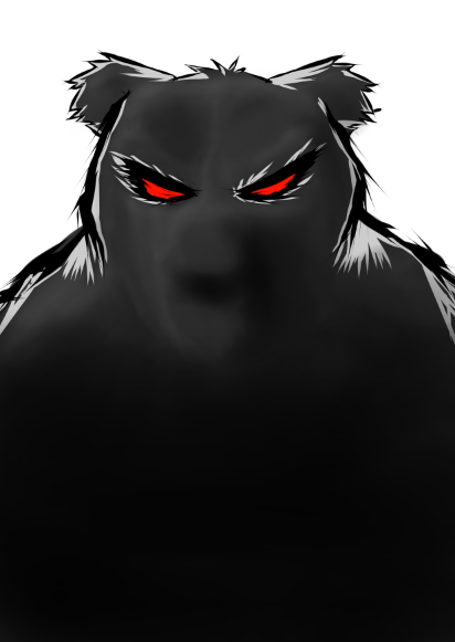
In order to make the bear feel a little more 3D rather than the flat feeling that you get from one solid colour, I introduced shadows and highlights just to make the face of the bear look more bear like.
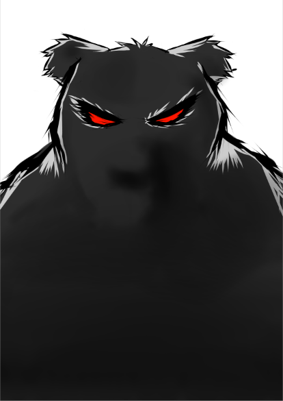
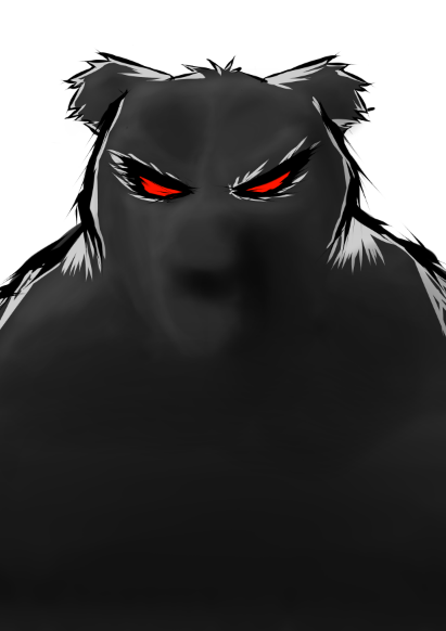
I wanted to position the title of the comic at the bottom half of the cover, so in order to allow for the title to stand out from the rest of the image I needed to make the lower half of the bear darker and create a gradient effect getting light the higher up the page it went.
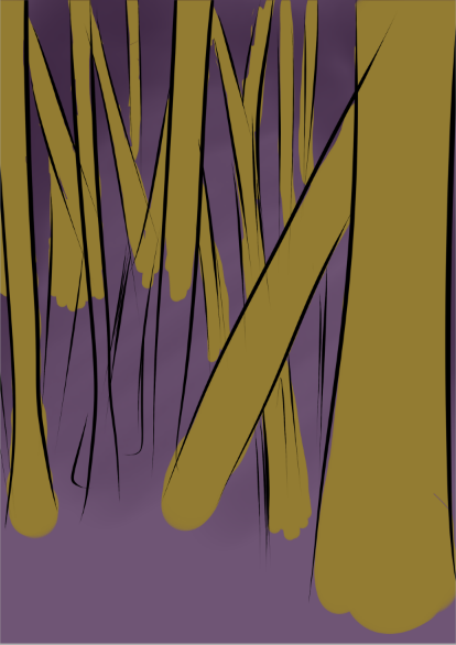
When it came to creating a background I needed it too look like the moon was shining through the trees of a woodland in the middle of the night, but there was one problem I had to overcome. I had to some how separate the dark colours from the bears silhouette with the dark colours in the background that showed it was night time. So I ended up using a deep shade of the colour purple to imply that it was dark and also allow the bear top stand out rather than disappear in one big dark blur.

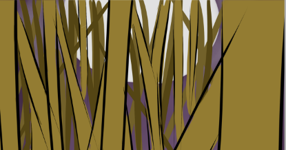
I wanted the background to look like a woodland, so I started off by drawing the outlines of trees onto a new layer above the purple background.

Once I had drew lines for the trees I needed to add colour to them. I started off by adding brown colours to the lines I drew before hand, and also included smaller strokes of darker colours of brown on a layer below to give the effect of trees further in the background.
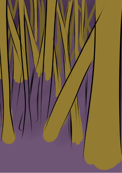

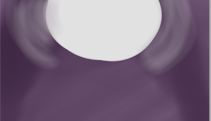
In order for the bear to have a silhouette and a white highlight, their needed to be some sort of light source from behind him. I created a moon at the very top of the image by using a soft brush set to the colour white and drew a semicircle at the top of the page.
Just having the brown of the trees and the purple background didn't really express how dark I wanted the setting of the image to be, so I needed to add a small amount of shading to the trees, and even add another gradient style darker shaded area that got lighter the further it got up the page.
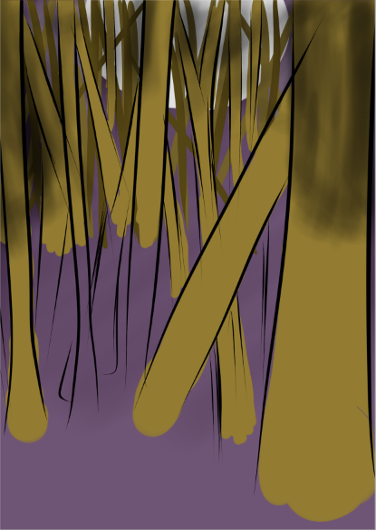
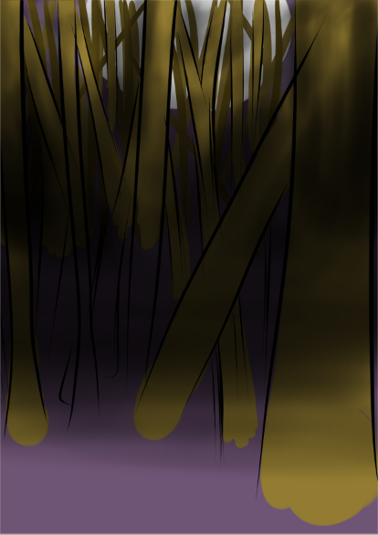
Now that the background was almost complete, All that was left was to add the title. But before that there was one more touch left to add to this.
After adding the dark shadows in the background with the trees, it left the moon looking rather dull. The way I got around this was by adding light beams that came from the moon and escapes through the trees. Once the Bear was added to the image afterwards, I could see this cover coming to life.


Now all that was needed was the title. The title was rather tricky when it came to typeface, as I hand drew it using my graphics tablet. The rest of the title was much more simple though.
I wanted to have a title that linked in with the storyline and also the characters of my comic, so I included a feather that links in with one of the main characters called Magpie. This magpie feather was hand drawn and then coloured using greys, greens and blues (traditional magpie wing feather colours). I also used a blend tool on the drawing software that I used to blend the colours to make the colours look as realistic as possible.
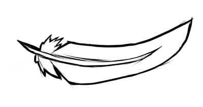
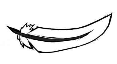
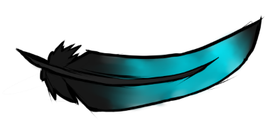

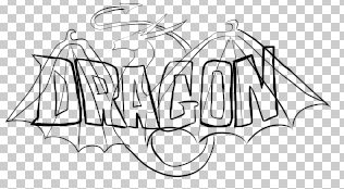
With the feather done, the title text was the only part left. I hand drew each letter for the typeface, making the whole cover fit together with a consistent cartoon style. The shaky and wobbly lines along with the wavy alignment give the letters character and a rather eerie feeling.

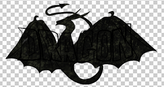
Now I just needed to apply all of the different aspects of the title together and add a few more touches.
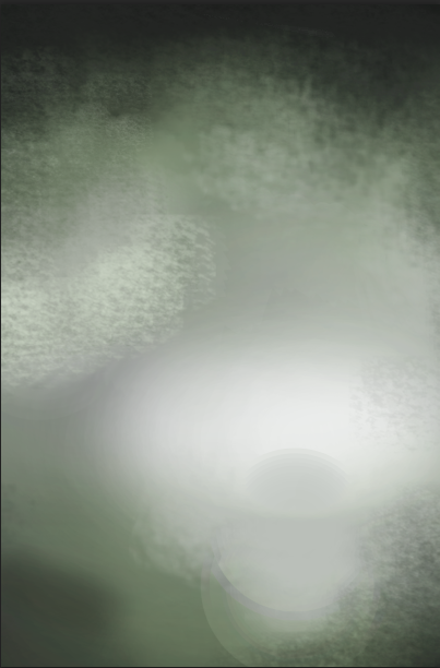
Once I had put the title and feather over the whole cover image, the black of the title mixed with the dark lines and colours of the feather along with the background and made them fade into each other, leaving the title almost undecipherable. I quickly got around this problem by setting my brush colour to white and using a softer brush with a low opacity to draw a foggy effect around the black text and the feather to make it stand out and allow you to see it much more clearly.

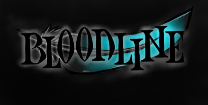
And with that done, the front cover draft for my comic book was complete. I am very happy with the design and how the whole image turned out. In the actual final piece there will be much more detail and more corrections of errors.