Wednesday 1 October 2014

Emulation

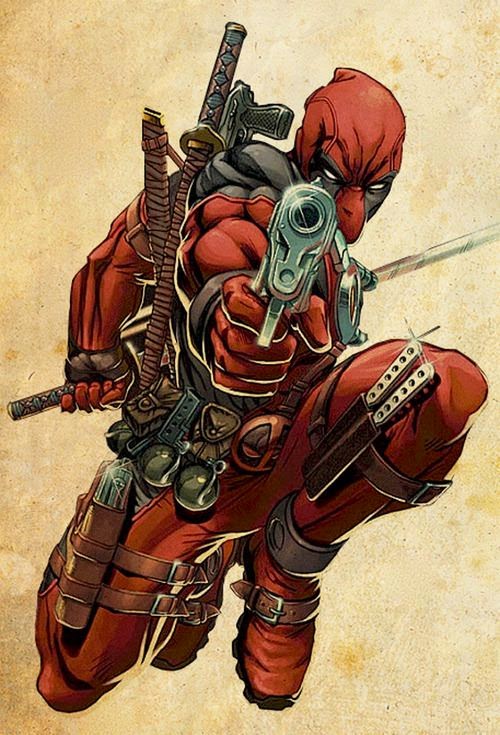
As an emulation of the style of the Deadpool artist copy, I needed to create something that linked with my comic book and also at the same time share certain aspects of the Deadpool image in order to show it was an emulation. 
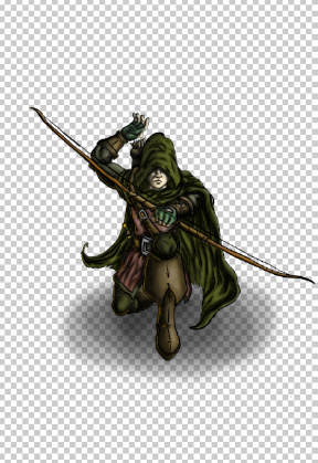
I ended up deciding to draw a medieval archer bent down on one knee. I took inspiration from the Deadpool image when drawing the pose of the character, as the image of his body has one knee bent backwards, and  has a gun aiming towards the viewer. I tried my best to emulate the pose in my own way by having him kneel and aiming a bow towards the viewer. I applied all of the same methods that I used when creating the artist copy. It was first drawn in pencil on an A3 sheet of paper.

After drawing it in pencil I used a light pad and a brush with ink to trace the lines onto yet another sheet of paper in order to get a darker black line. While going through this process, I took the time to use a thinner line on the body parts that were more towards the background of the image such as the hand that's reaching behind the head, and thicker lines for the parts that are closer to the foreground like the bow. This gives a sense of depth to the image as there is more detail visible in the closer areas of the image that the areas I want to appear further away. 

I needed to now make the lines stand out with a solid black so that when it came to colouring the lines would stand out from the colour. I did this by scanning the image into Photoshop and adjusting the threshold.

Once the ink picture was complete, it was time to start adding colour in Photoshop. To begin with I applied colours that were going to be the lighter tones. By doing this, it allowed me to develop a technique of shading that was fast, but also effective. 


I used a soft brush with an opacity of 14 set to black and started to apply shading to various areas of the image including creases in fabrics, shadows on the  floor, definition of facial features and muscle tone. 


As soon as the primary shading for the archer character was completed, a background was needed to complete the image. I once again looked back to the artist copy for inspiration and found a way of in keeping with the theme of the original picture. In the original, there is no back ground really other than what appears to be old looking paper. I had a think about what I could do to incorporate old and worn out paper in the background, but also make it link with the medieval theme I'm looking for, and came up with the idea of turning the paper in the background into a medieval map, with small illustrations of castles and dragons.

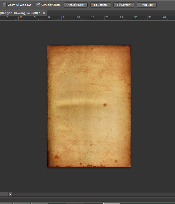
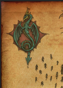
I started to create the map by getting a piece of paper and staining it brown with tea-bags to get the old and weathered look of a map. I then took it into Photoshop to edit the colours and levels to make it look even better.


Now that the base for the map was done, it needed some small illustrations of mountains and castles to give it a medieval impression. In my sketchbook I began to draw some small doodles and pictures that could be included in the map using a fine liner.


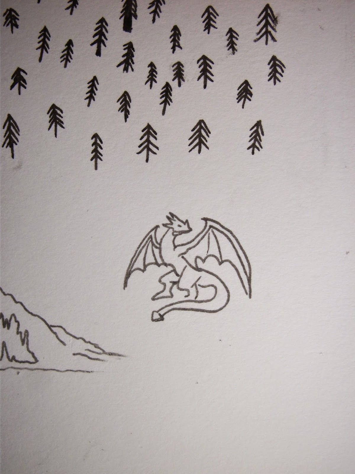
These were then taken into Photoshop and also had the threshold adjusted to make the lines more darker and defined. I then got rid of the white in the image using the magic wand tool. I then selected them and placed them onto the tea stained background and resized them so that the stained page now looked like map.


The next stage was to introduce a small amount of colour to these small doodle so that the map also attracted the eye. I decided to apply colour to the compass in the top left corner of the page, as a compass is the defining feature of any map.
I coloured and shaded the compass using the same method that I used for the archer character, but i used a desaturated colour pallet so that it wouldn't distract the eye from the primary focus point of the archer.


Once I had added the Ranger to the image my emulation was finished. 
Here is my finished product.


Comic-book Character Copy, Deadpool!

As a first copy for my comic book theme, I thought that drawing of a comic-book superhero was a good choice, as they are well known and also use exaggerated body poses which I thought would be a perfect challenge in order to give me a feeling for the style and process of comic-book art work.

The piece of work I chose to copy was a picture of the superhero/villain Deadpool I found on Pinterest while scrolling through various pieces of comic-book artwork.


I decided this was the Piece I wanted to use because of the pose that the character is in, the perception of depth from the gun pointing closer to the foreground and the katana sword that is more towards the background, and the contrasting direction of light e.g. the shadowed patches on the arms and legs also have a yellow light reference highlighting along the characters muscle tone. Its all these little things I saw in this photo that drove me to using it to produce a copy.

To start off, I had to draw from eye, the picture of Deadpool onto a piece of A3 paper using a pencil. It took a few tries at getting certain parts of the pose right such as the legs and positioning of the hands and fingers, but I finally finished and produced a drawing I was happy to work with.


The next step was to trace the image onto a new sheet of A3 ink paper, using an ink brush-pen and the light box. Using the brush-pen allowed me to define the lines, and correct mistakes I had made in the pencil drawing earlier. The only mistake I still made was that the line thickness stayed the same, rather than using thick and thin lines to define detail and depth in the image. This is however, a mistake I have learnt from, as i will keep into consideration this use of thick and thin lines when it comes to producing my emulation of this same style.


After finishing the inked line drawing, it was time to take things into the digital world. I scanned the inked drawing into the computer ready to take into the next step of colouring the image on Photoshop.


Once opened into Photoshop, I needed to make sure that I had a solid black  line to work with. In order to get this solid black line, I unlocked the layer my drawing was on, then went to Image, Adjustments, then Threshold. This then allowed me to adjust to my liking the intensity of the black and white in the image.


 Once I had adjusted the threshold of the lines, I used the magic wand tool and turned the contiguous setting off to get rid of the white in the image. This then left me with a black line upon a transparent layer, ready for me to start adding colour.


It was now time to start adding the colour to this image. I began by applying the lighter shades of the colour to the drawing, which then meant I could make these colours darker when adding shading the image. I used the Paintbrush Tool to add the colour, and adjusted the size and opacity of the brush to get the right look.


Once I had finished adding the base colour, I needed to add shading to make the image seem much more three dimensional less flat than it already appeared. In order to shade the image, I used again the Paintbrush Tool, with an opacity of 14 and the colour set to black for the darker shading, and for the lighter tones I used a brush with an opacity of 3 and a colour set to white. In order to make the shading look even more 3D,  I continued to go over places where I had previously been with the brush in order to make certain spots even darker or lighter.


Once the shading was complete, the picture was starting to take shape and look rather like the image i had originally found on Pinterest, but it was still missing certain details that needed attention.
One of these details Started on first was the yellow highlighted lighting on the arms and legs. To do this I used the Paintbrush Tool set to a 50% opacity and a yellow colour that matched the colour in the original image.


Once these small highlights had been added, the picture was starting to look even more like the original by the second. The next step was to introduce a background. In the image I had found originally, there seemed to be a background that looked rather allot like old yellowed paper. In order to get this, I had a look in my Grandads house to find some old paper, then scanned it into the computer, then took it into Photoshop to adjust the colours and saturation so it looked much more like the original image's background. Then all that was needed was to add it into the background of my picture.

Now I was getting into the final stages of producing my copy. The next thing I needed was to add the final touches. In the original image I based my work on, the gun and knives had lense-flairs that added to the illusion of making them seem like shiny metal. Yet again, I used the Paintbrush tool on a soft brush setting and two different shades of colour, one grey and one rather desaturated yellow colour. This produced a rather realistic lense -flair that achieved this sense of shine upon the gun and knives.

It was these lighting effects that drew me to this image of Deadpool, and it's now these lighting effects that added the finishing touches to my copy, and made it look somewhat similar to the origional.

And here is the final copied piece in comparison to the original.

Although I made a few changes and some mistakes to this copy, I am happy with my result and look forward to starting my Emulation of the same style as this piece of Comic-book art, and applying the things i have learnt from the mistakes I had made in this Copy.